Scribus
Scribus is a page layout and complete publishing solution.
Strengths [Weaknesses]
Professional
Scribus is a serious and professional solution for publications. It is the publishing tool for newstand magazine Linux Voice, online magazine GIMP Magazine, several independent CD booklets, published advertisements, and more. It delivers in both theory and practise.
Familiar
While no open source software ever “fools” people into thinking they are using a popular closed source application that they may be used to, if you are used to similar applications from the closed source world, Scribus has only a minor learning curve.
Weaknesses [Strengths]
Complex
Scribus is not a small application geared toward the consumer market. If your only experience with “layout” has been super-imposing text on photos in GIMP or writing business letters in Libre Office, then Scribus will be a shock to the system.
For computer-based workflows, the domain of the design world became available to everyone in the '80s with the rise of “Desktop Publishing”. It meant that one could use one's computer to layout each page in a booklet, and then send a master copy of all the layouts to a printer, and end up with professional-quality material.
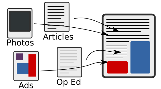
Scribus is not a word processor, and it's not a graphics application, it's a layout application. It's a part of the publishing pipeline, but not the entire thing. Many users just getting started in design, or just getting started in the “right” method of publishing, get confused by the fact that there is a pipeline at all. It changes with need and preference, but generally the pipeline for publishing is something like this:
Before computers, designers literally cut and pasted all the different assets from the different departments onto pages (much as traditional 'zine artists do now). With Scribus, you can do all that cutting and pasting in the computer, pre-flight the results, and send the master PDFs to press.
Install
Install Scribus from http://slackbuilds.org. It's a large application, so it might take a while to build.
Usage
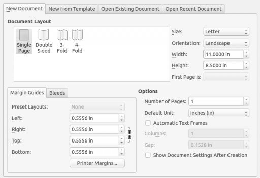
When Scribus starts, it presents a setup screen so that you can define what kind of project you are going to work on. This might seem overwhelming at first, but it does encourage a bit of pre-planning. You should think about your intended delivery targets before you start designing. For instance, if you'll be using Scribus for CD booklet layouts, you would know that the paper size needs to be 4.25 inches by 4.25 inches. You would also know that if it is printed, the total number of pages in your layout must be divisible by 4 (since one 8.5 inch page, folded in half, renders four printable surfaces), and so on. Before diving into a serious Scribus project, plan ahead and know what kind of paper you are delivering to.
If you are not sure, then talk to your printer company. Find out what they expect to receive from you. Usually a “reader spread” is all they need, meaning you simply deliver to them what you want your readers to see, in the order the readers will see it. In this case, each “page” really means “printable surface”. So if you want to produce a flyer with two sides to it, you need two “pages” in Scribus, even though when it is printed, it will require only one physical piece of paper. Likewise, if you are folding an A4 page in half in order to create a pamphlet, you need 4 “pages” in Scribus even though you will only use one physical sheet of paper when printing.
Content First
It doesn't always work out this way, but the ideal workflow for page layout is to get your content in first. For years on the web, designers tried to design sites by juggling both content and design all in one go, and they hated it so much that they reinvented their entire toolset with HTML5 and CSS3. Similarly, with printed material, you should try to have all the actual content amassed first, and then do the fancy design work, because otherwise you are designing blindly and when more or less content comes to you at the end, you are forced to re-do the design to accommodate. Start with your content first, and then design.
In most cases, the “content” is the text (or “copy” in publishing vernacular). Whether it's pages and pages of exposition or whether it's just a few blocks of bold statements, nailing down what textual matter is going to go into your design is the place to start.
Get text into Scribus with the Text Frame tool. Access this with the T key on your keyboard, or by clicking the Insert Text Frame button along the top toolbar. Draw a text frame on the page where you want the text to appear.
If you have used Inkscape or GIMP's text tools, this is exactly the same concept; you are defining the boundaries for the flow of the text. To get text into your text frame, you could just start typing but Scribus isn't exactly meant to be a word processor. It's generally better to compose your content in a proper text editor like Emacs (or Libre Office, if you're less adventurous) and then import it into Scribus. The historical rationale behind this is that the layout artist, in large publications, is rarely the author or copy editor. Even for a small publication, the separation of the processes is smart; let Scribus be a layout application, and let text editors be text editors.
To import text, right-click on your text frame and select Get Text, or just hit ctrl i on your keyboard. If you don't have a big text file lying around, navigate up through your file system to /usr/docs/gcc-* and use the COPYING file. Import it as text (not as a comma delimited file). Alternately, you can right-click your text frame and select Sample Text for some place-holder Lorem Ipsum content, but for the sake of this exercise use enough sample text to provide an overflow. You'll know you have overflow by the red X in the lower right corner of your text frame.
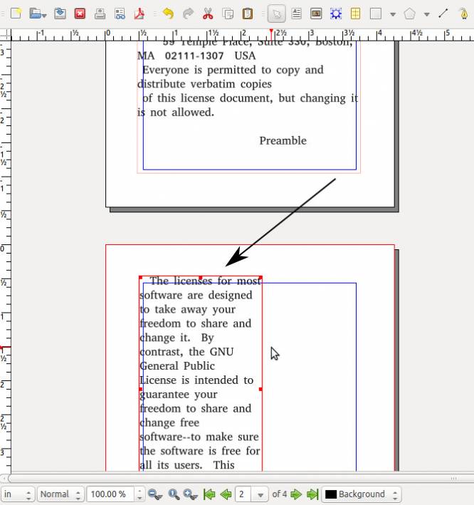
In page layout, text flowing outside of its boundary is hidden, but you can add more text frames and link them together so that the text flows from one to the other. To link two text frames, select the overflowing frame, and then click the Link Text Frames button in the button bar (or press the n key on your keyboard), and then click the second text frame.
Text Styles
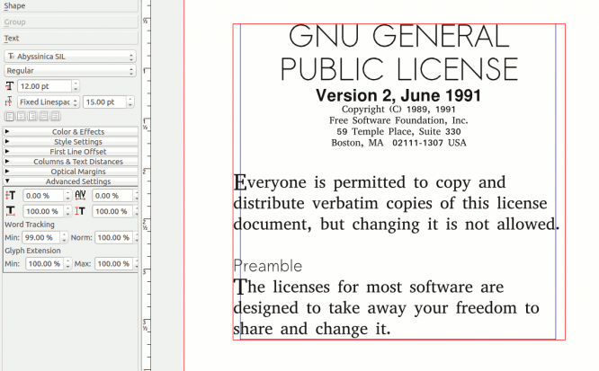
Styling and modifying text is done basically in the same way that you are probably used to in word processors. All text styling options are found in the Properties inspector. The Properties window is hidden by default; press F2 on your keyboard or select it from the Windows menu → Properties.
Using the Text tab of the Properties window, change the text size, font, style, leading, colour, and more.
Images
If you were only interested in text, you wouldn't be using Scribus. The point of Scribus is that it makes complex layouts easy to create. Once you have your text in your layout, it's time to start adding images.
To get an image, visit http://search.creativecommons.org and search for Creative Commons images, or use your own.
To insert an image into your layout, click the Insert Image Frame button in the top toolbar, or press the i key on your keyboard. Draw a bounding box to define where you want an image to appear and then press ctrl i to insert the image (or right-click on the empty bounding box and select Get Image).
Choose the image you want to appear in the bounding box area, and then click OK.
At first, you might not see all of the image, or any image at all if your image has an alpha channel around it, even after you have completed this process. This is a common issue, because many images are too large to fit into the space you have provided. Fix this by right clicking the bounding box and choosing Adjust Image to Frame.
Now the image is scaled down into your bounding box, but your text runs right through the image. You need to perform a text wrap.
A text wrap is performed from the Properties window, in the Shape tab. When wrapping text around images, you have four or five different options:
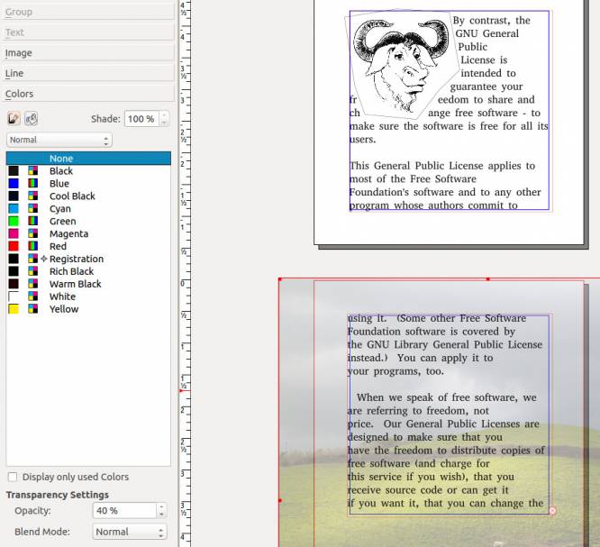
- Disabled: text wrapping is turned off. Good if you are using an image as a background texture and want your text to flow over it.
- Use Frame Shape: uses an internal bounding box called a “frame”, which you can modify with the Edit button in the Shape tab. This will cause the text to ignore the rectangular red bounding box and wrap itself instead around the frame that you draw around the shape.
- Use Bounding box: the rectangle you drew with the Insert Image Frame tool. It is always rectangular.
- Use Contour Line: this is a separate frame that never cuts off the visibility of your image. You can think of it like a force field that controls exactly how far in or how far away text can come to your image. It's very useful if you want text to fill in little gaps here and there but cannot modify your image frame without accidentally cropping the actual image.
- Use Image Clip path: uses paths as defined by path objects, not useful for image bounding boxes. If you are familiar with editing paths with nodes, then you can click the Edit button and modify the exact path against which the text will flow. Otherwise, you can use the bounding box as your wrapping definition. Either way, you will notice that the text in your text box flows around the image now, rather than through it.
Background Images
Of course, sometimes you do want an image to be sitting in the background with your text floating over it. This is also possible with Scribus.
Add a new text field to a new page if required, and flow the text into it. Draw an Insert image Frame bounding box over one of your pages, or a portion of your page. Add an image with ctrl i into the image bounding box, choosing a high-resolution photo for your background.
Once you have an image in your bounding box, your image covers up your text. This is because the image box was added after the text box; you need to send the image to a lower layer so that the text is sitting on top of the image instead of the other way around.
To adjust the layer hierarchy, click the X, Y, Z tab in the Properties window. Click on your image box and use the green arrows in the Properties window to lower the background to the very bottom layer.
You should see the text above the image, but probably the image is a lot more intense than you really want; after all, you don't want to make your readers struggle to make out the text over your background. A common trick here is to make the image less opaque; since the true background is white, this has the effect of multiplying white by all values in the image, increasing the brightness of each pixel. The background becomes muted, and the text stands out.
To adjust opacity, click the Colours tab of the Properties window. At the bottom of the colours panel, adjust the Opacity (under Transparency Settings) to something less than 50% or so.
Sidebars and Breakouts
In many magazines, there are sidebars or breakout sections in an article or story which gives related information that does not directly depend upon the rest of the text. For instance, the pamphlet being created in this article is the text of the GNU Public License (GPL) and has somewhat appropriate images (the GNU cartoon head is the logo of the GNU software group which programmes much of the software used in Linux, and the open field photo by Tim Sackton suggests openness and freedom).
Perhaps in addition to these elements, we might want to suggest some places where the GPL has been used to license technology. This would be a perfect use case for a sidebar.
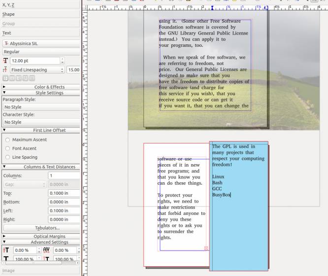
To create a new sidebar, draw a text frame down the side of a page with the Insert Text Frame tool. If needed, re-size any existing text frame so that your text does not overlap your new text frame.
Type in the text for your sidebar. Now to separate this sidebar from the rest of the article, give it a background colour by clicking the Color tab in the Properties window. In the Color tab, click the paint bucket icon for Fill and select a colour. If none of the primary colours provided appeal to you, you can define new colours in the Edit menu → Colors.
You can also adjust the shade of the colour with the Shade control in the Color tab. The text, by default, stretches to the very edges of the text field boundaries. You can add some padding around the edges in the Text tab of the Properties window. Use the Columns & Text Distances subsection to adjust the margins within a text field. Add just enough padding to bring the text away from the edges, and you'll end up with a nicely formatted sidebar.
Document Links
If you're using Scribus, you might be going out to actual paper at a professional printer's, but you might also want to enable your document as a more dynamic electronic paperless document as well. The most ubiquitous format that straddles both digital and print formats is PDF, and in PDF files, you can embed hyperlinks much as you would on a website, so that a user can click on keywords and be automatically taken to a specific page.
To create a link in a document, click the Insert Text Annotation button (it looks like a yellow sticky note) in the top toolbar. Draw the hotlink bounding box around the word or image you want to make clickable. You can always reposition or re-shape the clickable region later, so don't worry if you don't get it exactly right the first time. Once finished, double-click the region to see the Annotation Properties window.
In Annotation Properties, set Type to Link, and then set the Destination to whatever page in your document to which you want that hotlink to take the user. You can also link to other documents or websites.
Once you export your document as a PDF, this hotlink will become active. If a user views the PDF in a PDF reader and clicks on a link, the PDF reader will take the user to the appropriate page. If you have linked to a website, the user's default web browser will launch and open a window or tab to the appropriate URL.
Exporting
Whether you intend to stay digital-only and distribute your document as a PDF, or whether you want to have it professionally printed, the final step in your workflow is to export your masterpiece to PDF. One of the things that the PDF format is best for is to ensure that a document looks exactly the same from the time it is sent off to a printer until it is committed to the physical page.
You certainly wouldn't want to send your original Scribus file to a printer, and even if you felt that your printer had Scribus available to them, you would never want to risk sending the original file for fear of fonts changing from system to system, links to images failing, and so on. PDF is the pre-flight format of choice.
If your printer is tries to open your PDF file in an editor to make adjustments, find another printer; the PDF format is designed to be, in part, a pre-flight format. Its purpose is to ensure that what you send digitally is exactly what you see in print. If a printer needs to modify the contents of a PDF, then their workflow is wrong (they should at least be communicating to you what needs to change so that you can change it and send a new version), and you should use a different company. This is not a philosophical argument!
To export to PDF, go to the File menu → Export → Save to PDF.
First, a Preflight Verifier window will open. This is an automated check through your document that will catch common errors. Not all errors are blockers to your process; in the document being created for this article, the verifier warns that an image has transparency on page 3 and the text overflows on page 4. Image transparency does cause some problems for some printers, at least theoretically, and text overflowing would normally be a problem but in this example we don't really care that the text gets cut off on page 4.
In other words, use the Preflight Verifier as an advisor. Just because you see warnings or errors doesn't mean you can't continue to export. When in doubt, go back and check over your document to make sure it looks how you think it should look, and then continue to save to PDF.
A PDF export dialogue will open, and it has a lot of tabs. Don't panic. Most options are already set to sensible defaults for you. There are a few you should change:
- In the General tab, set Maximum Image Resolution to 300dpi if you plan on distributing as PDF as well as hardcopy. If you intend only to print, then don't set a maximum.
- In the Fonts tab, choose
Embed All Fonts. - In the Color tab, choose your intended output. If you intend to deliver digitally and to the printer, use the
Printeroutput option as it is suitable for both. - In the Pre-Press tab, place a check next to the Use Document Bleeds option.
- When satisfied, click the Save button.
Exporting to PDF can take time, since Scribus has to composite all of those different elements together. Give it a few moments, and then go and look at your finished product on your drive. View it in a PDF reader like Okular or xpdf so that you can see the document at its best. If it looks good on screen, it ought to look just as good in print.
If you do send it to a professional printer, be sure to let them know that you are sending a reader spread, meaning that the PDF you are sending is in the order that it is meant to be read, not printed. The printer will re-arrange the pages in the order that their printers require in order to print each page on the appropriate side of each page.
Page Layout and Beyond
Scribus is a professional-grade layout application with many more features than just the basics covered in this article. When designing, don't hold yourself back just because you don't know how to make something happen; find out how to do it, and design what you see in your mind's eye. Scribus and Linux has been used for professionally printed magazines, posters, postcards, stickers, flyers, pamphlets, and more, that have distribution as wide and sometimes wider than popular printed matter. With Scribus, combined with a few other choice open source tools and your own creativity, it's all possible.
