Colour Correction
Traditionally, the photographer's goal has been to make pictures look as realistic as possible. The point of making movies is [usually] to make the audience feel like they are there. You don't want the viewer to be cognizant that they are viewing a false representation of reality; you want the audience to really believe that the characters's lives are actually in danger, or that their love life matters more than anything else in the world, or that their quest really will change the fate of the galaxy.
For this reason, it is assumed that your ultimate goal when colour correcting is to make your movie look as realistic as possible. You might think that a camera naturally does this on its own, but in fact cameras and film stocks and electronic sensors are very different from the human eye. They are in many ways more limited than the human eye, and of course they lack any emotional interpretation of colour or light or shadow. So colour correction isn't just about correction what the camera picked up a little too dull, a little too bright, or a little too saturated; it's also about bringing human perception into your picture.
Colour Correction 101
The colour correction interface in Lightworks is a full-featured colourist environment that is easy to use regardless of your experience.
Before you start colour correcting, be aware that a good colour correction program can only provide as good a result as your footage allows. If you're working with heavily compressed source footage (it may not have been compressed consciously by you; digital cameras necessarily compress so that your footage will fit onto your media) then there is only so much colour space (or “gamut”) available. In other words, the higher the quality, the better the colour can be made to appear. That being said, nearly all footage can benefit from at least a little colour correction, so regardless of the level of compression, give colour correction a go.
Colour correction is always one of the final steps in film and video editing, for a few very pragmatic reasons:
- Saves on person-hours; you don't really want to spend hours colour correction a scene that is later cut from the picture.
- Saves on CPU cycles; colour correction can be demanding on your computer's processors, so don't burden it with more information that necessary.
- Provides better focus; by focusing first on the story as an editor and ignoring “minor details” like colour, you maximise your ability to tell a good story. Then focus on colour, sound, and so on.
- Consistency; by saving all colour correction for one dedicated sprint, you ensure that the look and style of your movie remains consistent.
Video signals are divided up into two categories:
- Luma, or the darkness and brightness levels of an image.
- Chroma, or the actual hues of colour you see.
Photographers divide the concept of luma values into three parts:
- Shadows, the darkest regions in an image.
- Highlights, the brightest regions in an image.
- Mids or midtones, the regions between the shadows and highlights.
The most “important” regions of a picture happen in the midtones because human skin is, or at least it should be as long as it was properly shot, in the midtone region. Humans who are watching your video will, by nature, be drawn to pay most attention to the humans in the shot, so the first goal of the colourist is to make the humans look good.
Complementary Colour
Video colour is additive. This is the opposite of what you will have learned if you are a materials artist in the physical world (in video, for instance, the combination of all colours is white rather than black).
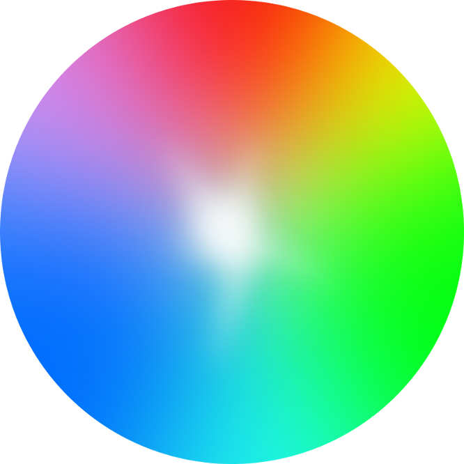
Complementary colours on a colour wheel are those that are opposite to another.
The opposite of red is cyan, the opposite of blue is yellow, and the opposite of green is magenta. You may already have seen this in action if you have worked on set, where you may have seen lighting crew place magenta gels over flourescent lights to “eat” the green hue, or an orange gel over a window to “eat” the blue sunlight (yes, sunlight is blue), or a blue gel over a lamp to “eat” the orange light.
The same principle applies in video colour correction. If an image is blue-ish or “cold”, add orange to “warm it up”. If an image is too yellow, add cyan. If there is spill from a green screen, add magenta. And so on.
Applying a Colour Effect
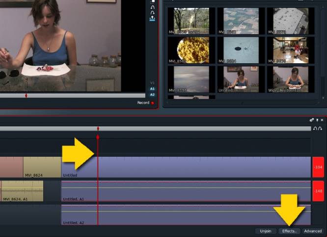
Once you're ready to colour correct, position the playhead in your edit over the first clip you want to work on. Click the Effects button.
In any given scene, you should start by colour correcting a shot with a person in the shot: whether you like it or not, your audience is judging the look of your picture by the humans in your shots, so correct for human flesh tones first and let everything else fall into place around that.
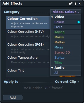
In the Add Effects window that appears, select the Video, Colour category from the pop-up menu in the upper right corner.
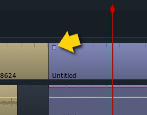
From this category, choose the colour correction effect. Notice that a square dot appears in the top left corner of the video clip in your edit window once the effect is applied.
The Interface
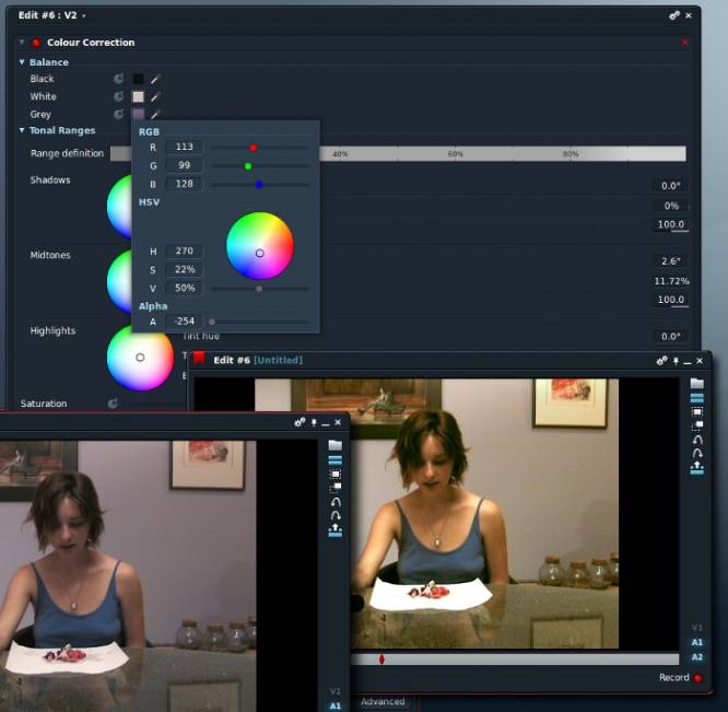
The colour correction interface is actually three separate panels in one. First, at the top, there are the global Balance controls. Adjustments made here are applied to the entire image, regardless of colours range. This is used mostly for big, over-all changes in the brightness levels of your picture.
The Tonal Ranges panel allows for hue adjustments within specific luma ranges; in other words, if you need to add coolness to the dark regions of your picture, then you might add blue to the Shadows. If you need to add warmth to a bright summer day, you might add orange to the Highlights. If you want to make a person look more alive and vibrant, you would add amber to the Midtones.
Within the Tonal Ranges panel there are further controls for saturation, gamma, contrast, brightness, and gain. These are not governed by tonal ranges such as highlights/midtones/shadows but can be limited in other ways.
Balance
The human eye is capable of seeing a wide spectrum of light (although not, obviously, the entire spectrum) and celluloid film is able to capture a fair representation of what we see in real life. Digital video is far more limited, losing significant amounts of information from bright areas and introducing noise into dark areas, and as a result compressing the amount of information in the mids.
For this reason, it's the tendency of a colourist to emulate real life contrast levels when correcting what film and video are able to capture. This means deepening the shadow areas to give the impression that the viewer is able to see deeper shades of darkness than the film or video was able to capture, and more vibrant touches of brightness than the cameraman could allow for fear of losing information. In other words, a colourist will actually constrain the range of contrast in order to give the illusion of a greater visible spectrum.
To adjust contrast, use the Balance controls at the top of the Color Effect window. Either use the eye-dropper to select your desired darkest (or brightest) points, or use the manual adjustments.
Tonal Ranges
Your audience is watching the people in your shots, whether you want them to or not. Humans are drawn to the human characters in a picture, so when adjusting colour it is always to make the humans in the shot. All other colours will fall into place around them.
Assuming you want the actors to look more alive, more life-like, more vibrant, the simplest and most common trick of the trade is to add amber. Since human skintone falls within the average luma range, use the colour wheel labelled Midtones to add orange/amber (in other words, subtracting blue/cyan). If you think better in RGB than in hue and saturation values, use the sliders above the colour wheel.
The difference will be obvious immediately. Less is more, as they say, so don't over-do it, but a little bit of amber adds a remarkable amount of life to your Talent.
Other Controls
The Saturation and Gamma, Brightness, and Gain controls at the bottom of the colour window provide some additional control over the chroma and luma end results. As you would expect, saturation will sweeten or dampen the strength of the colour hues in the overall picture, while brightness and gain will affect the overall brightness or darkness of the picture. These can all be powerful tools for either correction or for stylization.
Keyframing
As with most effects, you can keyframe colour correction using the Keyframes control at the very bottom of the colour window. The principle is the same as with any other basic keyframing interface in any other editing, animation, or effect programme:
- Move the playhead in the keyframe strip to some point in time and then add a keyframe with the
+button on the left. - Make the colour adjustments for that point in time.
- Move the playhead to the next point in time, create a new keyframe.
…and so on. In the end, you'll have animated colour changes.
Better One? Better Two?
It's a characteristic of the human eye that it adjusts quickly to changes in light quality. In fact you've probably experienced the change in vision when you move from being outside in the sunlight all day to being inside under artificial lighting; at first, the change is stark but as you spend time under the new lighting, it subtly evens out until your eyes are accustomed to it and you don't even realize you ever were cognizant of the shift.
The same thing happens when you sit down to colour correct. Try to do an entire scene in one sitting. If you must get up to take a break, come back to work resolved to do another scene in the next sitting. Do not interrupt your work within a scene, or the colour shift from before your break and after your break will probably be noticeable.
The best way to really see the difference between your colour correction and the original footage is the simple “turn it off, and on again” trick.
Click the red button at the top left of the colour effect window to deactivate the colour effect. Look at your image. And then click the button again.
The difference will probably amaze you. No matter how long you've been colour correcting, the impact is never lost.
Learn to manage your media better with Asset Management, in to the next section.
