Colourspace
As with nearly everything else in technology, managing your colourspace is only important if you actually put it to good use. Among those who do not understand technology but nevertheless insist upon having only “the best”, there is an all too common belief that no professional artist can work without the widest gamut and most stringent colourspace management. This is similar to insisting that real artists only use very specific brand-name computers and software; the focus is placed on the tools rather than the results.
Managing colourspace is only useful if you need to manage your colourspace. If you are developing graphics for the web, colourspace matters a lot less (since there is no way to manage the exact colours that your audience is seeing), whereas if you are printing photos or matching effects back to source video footage, the colourspace is hugely important because you are targeting known values.
Whatever your feelings on Colourspace, or whether you have ever heard of it before or not, this section examines the issues from all angles.
OpenColorIO
The Slackbuild queue file installs the OpenColorIO libraries from Sony Imageworks, to support applications that take advantage of it.
To verify that you have it installed;
$ ls /var/log/packages/*opencolor*
Colour
The problem with the term “colour” is that it describes two things: wavelengths of light (which is a natural phenomenon and can be described in absolute terms) and what human eyes see and the human brain labels (which, being subject to human interpretation, varies wildly). Human perception gives way to an interesting phenomenon whereby several different wavelengths can be seen as the same colour.
This phenomenon is called metamerism, and is defined in colorimetry as the apparent matching of a colour despite a difference in spectral power distribution.
This is possibly the most important principle to understand in practical colour theory, because for many people that will all the colourspace management required: in the words of Inkscape artist HeathenX, “close enough is good enough”. In other words, if a photo graph or graphic design looks more or less the same on screen as it does after being printed, then your colourspace management is successful.
The aggravation happens when those colours do not look the same, and the artist is left to perform test print after test print (or test compression, or test conversion, or whatever) to discover what amount of distortion on the screen is required in order to end up corrected on the final delivery media. In that case, colour management is failing, and needs correction.
Gamut
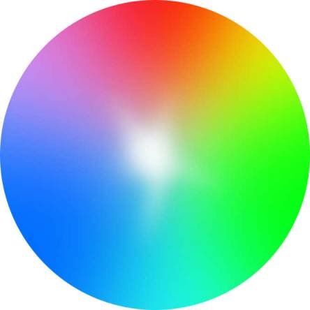
Digital colour is expressed as chroma, and it has three values: red, green, and blue (RGB). All of these values combined produces white (not black, as they do in printed media).
Since white is a known absolute value (all lights on full power: 255, 255, 255 or #fff), it is used as the origin point for any colour that is not white. In other words, colour values can be expressed as how far from the baseline of “all the way on”.
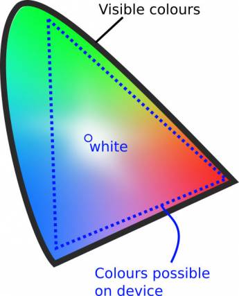
A device that renders colour has, inherently, some definition of what colours it is able to produce. Most modern devices are capable of producing a little under 17 million colours, but colours are produced in relation to either a white or black value. If you want to produce the colour “green”, then you must know how green?, and we define how “green” something is depending on how far from absolute white it is located.
A colourspace includes, therefore, a defined reference point for absolute white. Using this as a starting point, a device knows how much of each colour needs to be painted onto each pixel in order to generate certain hues. But everything is always relative to that the white point that is generated by that colourspace. What is white on one device will look off-white, or gray, or cream, or pink, or blue, and another device.
The layout of a colourspace is called a gamut. A gamut is the set of possible values with a colourspace, with a reference point for defining white.
Converting Colourspaces
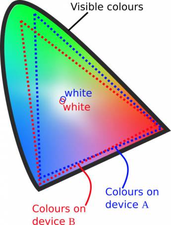
Problems arise when colourspaces do not align. For instance, a photograph taken on a camera white balanced to see white at a wavelength of 300×200 nanometers will look quite different on a screen with a colourspace configured to see white at 350×300. Since all colours are relative to absolute white, the entire photograph suffers from a total colour shift unless:
- The image is re-mapped, or converted, to your current working colourspace (usually this is an option provided you when you load a photo in an image editor). If you do this, the image data changes; that may or may not be a problem for you, but it is something to be aware of, especially if you are trying to preserve as much of the original data as possible (for instance, in the event that you are not the final stop in the pipeline, and everyone after you is working in the original colourspace).
- Your current working colourspace is changed. In this case, the image is unchanged, and only your environment shifts. You can try this experiment yourself with xcalib and a few ICC profiles.
To sum up, when two colourspaces are different, they must be conformed with the goal of producing the same set of colours even though the wavelengths producing those colours may differ. Colours that look the same but are produced by different wavelengths are called metamers.
So the goal in converting colourspace is to have no visual difference, but since gamuts are different across devices, conforming two of them does risk losing information.
For instance, pixels that were painted blue in one colour space might be forced closer to white to stay within the gamut, giving the blues a less saturated appearance. Pixels that were red might be forced away from the white point, making them appear “more red” after conversion.
Or the colour gamuts may not even be within range of one another. For example, if a camera with a particularly wide gamut produces movie footage in one colourspace but it must be converted to another colourspace to match footage from another camera, then colours may be lost by way of being converted down into the more restrictive gamut. In fact, colours may not only change in saturation, but also in hue, if the colourspaces are sufficiently different.
Colourspace Conversion
One of the largest gamuts in practical use today is the Academy Color Encoding System (ACES), an open source toolkit provided by the Academy of Motion Picture Arts and Sciences. This gamut encompasses a wide spectrum of possible colours, and is mostly used as a master profile from which more limited profiles can be calculated.
It is akin to saving a RAW image to TARGA for later compression to PNG, or a movie file to HuffYUV as a source for WEBM and MP4 files, or audio to WAV or ALAC for compression to OGG or FLAC.
If you are dealing with several colourspaces that require conforming, experiment with ACES to see if it is a suitable intermediary between colourspaces. If your spaces are similar, you may not need an intermediate step.
Selecting a Colourspace
Rarely does anyone get to choose a colourspace; it is often decided for you by the camera that you use to capture an image, or the destination you are targeting for your final product.
For “normal” people, colourspace boils down to your everyday work environment and what it is capable of using. If you have a standard computer monitor, it doesn't much matter how wide the gamut is of the camera you are using, because everything is going to end up conforming to the colourspace of your monitor.
In that case, the usual default colour space (probably sRGB) is probably sufficient. For additional colour profiles, install the iccprofiles from http://slackbuilds.org.
To make matters more complex, there are several colourspace conversions potentially happening as you work:
- An image file has an embedded colourspace inherited from its source device (camera, scanner, image application)
- Your computer monitor has its own gamut of all possible colours it can produce, which is defined as its own colourspace.
An ideal setup would be one in which each device and each application used the same colourspace. This rarely happens, but it's a good reminder not to over-think colourspace; if your camera produces, for instance, an sRGB image, and your computer is happy to use sRGB, then standardise on that. If your camera embeds Adobe_RGB and your computer can happily use that, then standardise on that.
Whatever you end up using, you want to ensure that your monitor can represent that colourspace well. Pragmatically speaking, just settling on defaults is not usually the worst thing in the world; there may be a few minor annoyances, but if everything is within your range of tolerance and you accept that your audience is probably going to see it on different devices anyway, then you may have your colour workflow figured out sufficiently.
Generating Your Own Profile
If precise colour matching does matter to you, then create your own ICC profile specific to your computer screen.
To calibrate a display so that you can maximise its colour accuracy, you need a hardware colour calibrator. An open source compatible (and, in fact, open source itself) colorimeter is the ColorHug. It ships with a Live Linux CD that you can boot into, run a color calibration sequence, and then export the ICC profile that it produces. The resulting ICC profile is good for your monitor, and can be used on a systemwide basis by setting your colour setting with xcalib.
You must do this for each screen in your pipeline so that each monitor has the ability to utilise its full gamut. If you do not calibrate a monitor, then even though you might be using foo.icc from camera to software, your monitor is probably not displaying it accurately. So the image file and the software agree; the data is correct, but your eyes are being lied to. And in the end, that's really what matters.
A custom-generated ICC profile is your display profile, meaning that it is driving the lights in your LED monitor that illuminate the pixels. It does not change the embedded colourspace of the images you work on. Having a properly calibrated display ensures that the embedded profile is rendered as accurately as possible on your monitor, but you should still be tracking the colourspace embedded in your images, and keeping them consistent throughout your workflow.
If you do have [mostly] complete control of your pipeline, then choosing a gamut that fits all of your devices is basically your only restriction, Calibrate all devices to your gamut, and use the colourspace throughout your workflow.
Delivery
The colour space of your final medium dictates what colourspace to use as your final output (whether you consciously output to it or not). The International Color Consortium (ICC) and the European Colour Initiative (ECI) have produced several industry standard colour profiles which are generally safe to assume are your target profiles.
Regardless of your control over the colourspace, it is delivery that is, as always, the one thing no one ever controls entirely. Even if you own the theater or the art gallery showing your work, you probably don't control ambient light levels,and you certainly don't control the proteins in people's eyes, or an individual's reaction to a specific shade or combination of colour. Use the science behind colour to work around technical limitations, but the key to great colour is an art, not science. Use your eyes and your own artistic sensibility, and make something beautiful.


