**This is an old revision of the document!**
Colourspace
As with nearly everything else in technology, managing your colourspace is only important if you actually put it to good use. Among those who do not understand technology but nevertheless insist upon having only “the best”, there is an all too common belief that no professional artist can work without the widest gamut and most stringent colourspace management. This is similar to insisting that real artists only use very specific brand-name computers and software; the focus is placed on the tools rather than the results.
Managing colourspace is only useful if you need to manage your colourspace. If you are developing graphics for the web, colourspace matters a lot less (since there is no way to manage the exact colours that your audience is seeing), whereas if you are printing photos or matching effects back to source video footage, the colourspace is hugely important because you are targeting known values.
Whatever your feelings on Colourspace, or whether you have ever heard of it before or not, this section examines the issues from all angles.
Colour
The problem with the term “colour” is that it describes two things: wavelengths of light (which is a natural phenomenon and can be described in absolute terms) and what human eyes see and the human brain labels (which, being subject to human interpretation, varies wildly). Human perception gives way to an interesting phenomenon whereby several different wavelengths can be seen as the same colour.
This phenomenon is called metamerism, and is defined in colorimetry as the apparent matching of a colour despite a difference in spectral power distribution.
This is possibly the most important principle to understand in practical colour theory, because for many people that will all the colourspace management required: in the words of Inkscape artist HeathenX, “close enough is good enough”. In other words, if a photo graph or graphic design looks more or less the same on screen as it does after being printed, then your colourspace management is successful.
The aggravation happens when those colours do not look the same, and the artist is left to perform test print after test print (or test compression, or test conversion, or whatever) to discover what amount of distortion on the screen is required in order to end up corrected on the final delivery media. In that case, colour management is failing, and needs correction.
Gamut
Digital colour is expressed as chroma, and it has three values: red, green, and blue (RGB). All of these values combined produces white (not black, as they do in printed media).
Since white is a known absolute value (all lights on full power: 255, 255, 255 or #fff), it is used as the origin point for any colour that is not white. In other words, colour values can be expressed as how far from the baseline of “all the way on”.
A device that renders colour has, inherently, some definition of what colours it is able to produce. Most modern devices are capable of producing a little under 17 million colours, but colours are produced in relation to either a white or black value. If you want to produce the colour “green”, then you must know how green?, and we define how “green” something is depending on how far from absolute white it is located.
A colourspace includes, therefore, a defined reference point for absolute white. Using this as a starting point, a device knows how much of each colour needs to be painted onto each pixel in order to generate certain hues. But everything is always relative to that the white point that is generated by that colourspace. What is white on one device will look off-white, or gray, or cream, or pink, or blue, and another device.
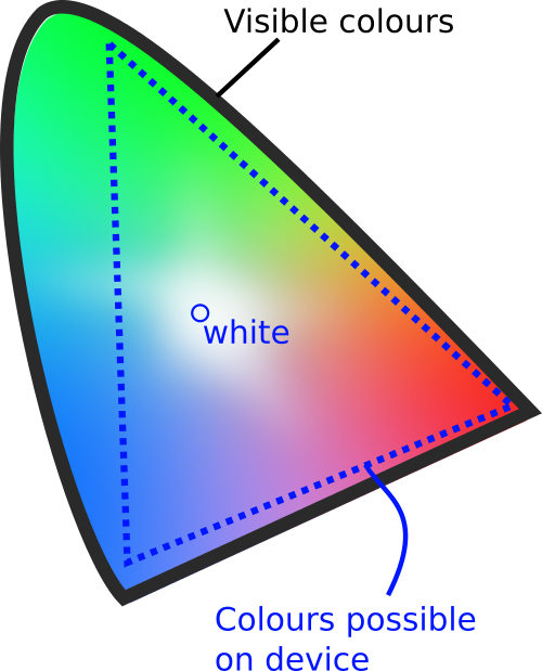
The layout of a colourspace is called a gamut. A gamut is the set of possible values with a colourspace, with a reference point for defining white.
The largest gamut in practical use is the Academy Color Encoding System (ACES), an open source toolkit provided by the Academy of Motion Picture Arts and Sciences. This gamut encompasses a wide spectrum of possible colours, and is frequently used as a master profile from which more limited profiles can be calculated. It is akin
Colors that match this way are called metamers.


